A Practical Guide for Business Owners, Marketers & Web Designers
You built a website. You put time, money, and energy into it. But visitors keep leaving without buying anything, signing up, or even reaching out. Sound familiar?
You are not alone. A 2025 study confirmed that 88% of online consumers are less likely to return to a website after a bad user experience. And most of the time, the problem is not your product or your price. It is your website design.
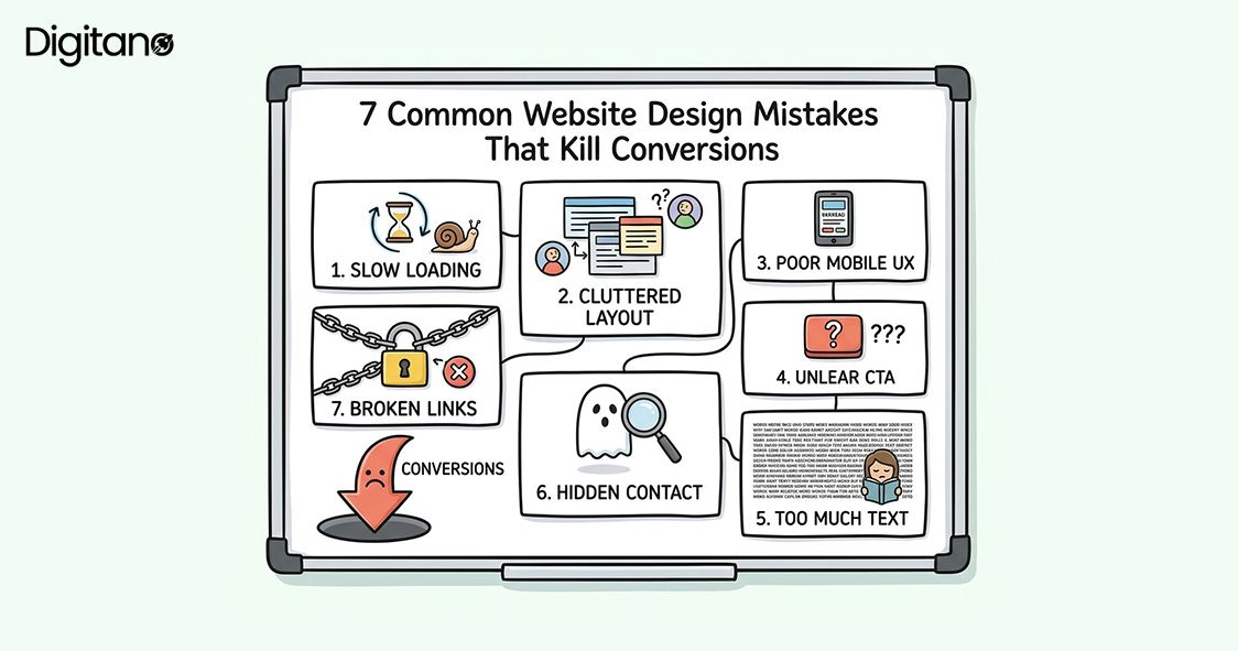
In this article, we will walk through 7 of the most common website design mistakes that quietly destroy your conversion rate. Each one is backed by real 2025-2026 data. And most importantly, each one is fixable.
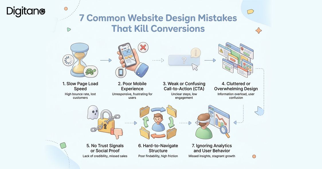
Mistake #1: Slow Page Load Speed
The first impression your website makes is not visual. It is speed. People are impatient online and the data in 2025-2026 is even more unforgiving than before.
Google also uses Core Web Vitals including page speed as a ranking factor, which means a slow site hurts your SEO and your sales at the same time. A two-second delay in load times raises cart abandonment to 87%. And slow websites cost retailers an estimated $2.6 billion in lost sales every year.
How to Fix It:
Use Google PageSpeed Insights (free) to test your site right now. Then tackle the biggest speed killers:
- Compress and convert images to modern formats like WebP or AVIF oversized images are the most common speed killer.
- Use a CDN like Cloudflare to serve content from servers close to your visitors.
- Audit and remove unnecessary plugins or third-party scripts each script adds load time.
- Upgrade to quality web hosting if you are on a shared server it makes a significant difference.
- Aim for a Largest Contentful Paint (LCP) under 2.5 seconds and a load time under 2 seconds meeting Core Web Vitals reduces abandonment by 24%.
Mistake #2: Poor Mobile Experience
More than 61% of all web traffic now comes from mobile devices (Statista / StatCounter, 2025). If your website is hard to use on a phone, you are turning away the majority of your visitors before they even read your offer.
Google has used mobile-first indexing since 2019, meaning it ranks the mobile version of your website, not the desktop version. A bad mobile experience lowers both your SEO rankings and your user trust. Mobile conversion rates currently average 1.4-2.0%, compared to 3.2-4.1% for desktop, a gap almost entirely explained by poor mobile UX rather than user intent.
How to Fix It:
Use a responsive design that automatically adjusts to different screen sizes. Specifically:
- Test your site on multiple real devices, not just desktop Chrome. Use Chrome DevTools to simulate different screen sizes.
- Make buttons at least 44x44 pixels and keep font sizes above 16px for readability.
- Enable one-tap payment options (Apple Pay, Google Pay, Shop Pay) they are the primary driver closing the mobile-desktop conversion gap in 2025-2026.
- Reduce checkout form fields on mobile 81% of users abandon forms after starting, and shorter forms dramatically improve completion rates.
- Ensure pop-ups have clear, thumb-friendly close buttons pop-ups that cannot be easily dismissed are one of the most common mobile UX complaints.
Mistake #3: Weak or Confusing Call-to-Action (CTA)
Your Call-to-Action (CTA) is the button or link that tells visitors what to do next. It is the most important element on any page. And yet, many websites get it completely wrong.
Common CTA mistakes include using vague text like 'Click Here' or 'Submit', having too many competing CTAs on one page, placing CTAs where visitors cannot easily find them, and using button colors that blend into the background. CTA text using action verbs 'Get', 'Try', 'Download', 'Start' consistently outperforms passive labels like 'Submit' or 'Continue' in A/B tests.
How to Fix It:
Fix your CTAs with these proven principles:
- Use one clear, action-oriented CTA per page multiple competing CTAs cause decision fatigue and lower all of them.
- Make it specific: instead of 'Submit', say 'Get My Free Quote' or 'Start My Free Trial'. Specific CTAs tell visitors exactly what they get.
- Use a contrasting color that stands out from your page background the button should be impossible to miss.
- Place at least one CTA above the fold so visitors can see it without scrolling.
- Test your CTA copy even small wording changes can move performance by 10-20% in A/B tests.
Mistake #4: Cluttered or Overwhelming Design
When a website tries to say everything at once, it ends up saying nothing. Cluttered design is one of the fastest ways to lose a visitor and the data shows it is also the most common professional mistake.
A study by Google found that users judge a website's visual appeal in just 50 milliseconds. Too many fonts, colors, images, and blocks of text overwhelm the brain and trigger decision fatigue. The Hick-Hyman Law in psychology states: the more choices you give someone, the longer it takes them to decide. And often, they decide to leave. Nearly 94% of first impressions are based on design which means visual clarity is not a nicety, it is a revenue driver.
How to Fix It:
Embrace simplicity with these principles:
- Embrace white space, empty space is not wasted space. It guides the eye and reduces cognitive load
- Limit yourself to 2-3 fonts and a simple, consistent color palette throughout your site
- Break content into short paragraphs of 2-4 sentences. Long blocks of text are visually intimidating on screens
- Focus each page on one goal every element that does not serve that goal should be removed
- Less is almost always more. If you are not sure whether to include something, leave it out
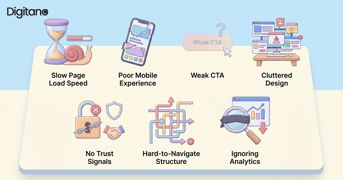
Mistake #5: No Trust Signals or Social Proof
People buy from people they trust. But a faceless website with no reviews, no client logos, no testimonials, and no security badges gives visitors no reason to trust you. In 2026, trust signals have never mattered more.
In 2026, consumers use an average of six review sites before making decisions (BrightLocal). They also expect recency 73% of consumers do not trust reviews older than one month. Products with 5 or more reviews are 270% more likely to sell than those without any. And displaying customer reviews can boost sales by 19.8% on average.
Trust signals include: customer testimonials and star ratings, case studies and success stories, logos of well-known clients or media mentions, SSL certificates and security badges, money-back guarantees, a visible physical address or phone number, and response times to reviews that show an active, responsive business.
How to Fix It:
Build trust signals into every key page:
- Add real customer reviews to your homepage and product pages prioritize recency, as 73% of consumers don't trust reviews older than a month.
- Display logos of companies you have worked with, and any press or media mentions.
- Make sure your site has HTTPS the padlock is a basic trust signal that visitors notice.
- Add a satisfaction guarantee if possible it removes risk from the decision.
- Respond to every review promptly. In 2026, 19% of consumers expect a same-day response and 32% expect a reply by the following day.
Mistake #6: Hard-to-Navigate Structure
If visitors cannot find what they are looking for in a few clicks, they leave. Navigation is the roadmap of your website. A confusing roadmap means people get lost and give up.
Research from Forrester shows that well-structured navigation can increase website conversion rates by up to 18%. Yet many websites have navigation menus with 10+ items, confusing category names, no search function, and no clear path toward the main goal. The 3-click rule is a useful guideline: visitors should be able to find any page or piece of information in 3 clicks or fewer. If it takes more than that, rethink your structure.
How to Fix It:
Simplify your navigation with these changes:
- Keep your main navigation to 5-7 items maximum more than that creates decision fatigue.
- Use clear, simple labels that match the language your customers actually use. Avoid clever or jargon-heavy names.
- Add a search bar for content-heavy sites it is one of the highest-ROI additions for sites with large catalogs.
- Make your logo clickable and linked back to your homepage this is expected by users and helps when they feel lost.
- Use breadcrumbs on deeper pages so visitors always know where they are in your site structure.
- Check your most-visited paths in Google Analytics 4 follow where real users go, not where you think they should go.
Mistake #7: Ignoring Analytics and User Behavior
Many website owners make decisions based on personal taste instead of real data. This is like flying a plane blindfolded. Without analytics, you are guessing and guessing costs you conversions every single day.
Without analytics, you do not know which pages people leave immediately (high bounce rate), where they click and what they ignore, which devices they use, how far they scroll, or where they drop off in your checkout or sign-up flow. The CRO tools market is projected to reach $5.07 billion by 2025 driven by businesses that understand data-driven design produces measurably better results. AI-powered CRO platforms now claim average conversion lifts of approximately 25% for adopters.
How to Fix It:
Start using data to drive decisions this week:
- Install Google Analytics 4 (free) if you have not already it tracks the full user journey across devices.
- Use Microsoft Clarity (free) for heatmaps and session recordings to see exactly where users click and how far they scroll.
- Look for pages with bounce rates above 70% or session duration under 60 seconds; these are your biggest leak points.
- Review your data monthly and make small, hypothesis-driven changes then measure the result.
- Run A/B tests when making significant changes to CTAs, headlines, or layout 77% of businesses worldwide use A/B testing on their websites (VWO, 2025).
Quick Summary: 7 Mistakes at a Glance
Here is a quick reference table of all 7 mistakes and their most important fixes:
Frequently Asked Questions (FAQs)
Q1: How do I know if my website design is hurting my conversions?
A: Start with Google Analytics 4. Look for pages with a high bounce rate (above 70%) or a low average session duration (under 60 seconds). These are warning signs that visitors are not engaged. Also use Microsoft Clarity (free) to see heatmaps showing exactly where people click, how far they scroll, and where they drop off. In 2025-2026, 69% of marketers report web analytics tools as their most important CRO method and for good reason.
Q2: What is a good website conversion rate in 2026?
A: The average website conversion rate across industries in 2025-2026 is approximately 2.9% (Convergine / SQ Magazine, 2025). The top 25% of landing pages convert at 5.31% or higher. For e-commerce specifically, a realistic global range is 1.8-3%, with a rate above 3% placing you in the top tier. For lead generation landing pages, the median across 41,000 pages analyzed by Unbounce was 6.6%. The important thing is that your conversion rate improves over time benchmark against your own history, not just industry averages.
Q3: Do I need to redesign my entire website to fix these mistakes?
A: Not at all. Many of these fixes are small and targeted. You can improve your CTA without touching the rest of the page. You can compress images in an afternoon. You can add testimonials to your homepage in an hour. A full redesign is expensive and time-consuming. According to GoodFirms research, 80.8% of businesses redesign specifically for low conversion rates but the best approach is usually targeted optimization first, not a full rebuild.
Q4: How important is mobile design really?
A: Extremely important. As of December 2025, mobile accounts for approximately 54-61% of all global web traffic (StatCounter / Statista, 2025). Google also ranks the mobile version of your site first under mobile-first indexing. Mobile cart abandonment rates run 78-82%, compared to 68-72% for desktop, a gap largely explained by poor mobile UX. If your mobile experience is frustrating, you are not just losing mobile visitors. You are likely also ranking lower in search results, which reduces all your traffic.
Q5: What free tools can I use to improve my website design?
A: Here are the most powerful free tools available in 2026:
- Google PageSpeed Insights: check and diagnose your Core Web Vitals and page load performance.
- Google Analytics 4: track visitor behavior, conversion funnels, and device breakdowns.
- Microsoft Clarity: free heatmaps and session recordings (comparable to Hotjar, completely free).
- Chrome DevTools: test mobile responsiveness and debug performance directly in your browser.
- Google Search Console: monitor SEO performance, index coverage, and Core Web Vitals from Google's own data.
Q6: How long does it take to see results after fixing these design issues?
A: Some improvements are immediate. A faster loading page starts retaining more visitors right away. A stronger CTA can increase clicks within days of going live. Others, like building trust through a growing bank of reviews or improving SEO through better mobile design, take weeks or months to show full results. AI-powered CRO platforms in 2026 now report average conversion lifts of approximately 25%, but these come from sustained optimization programs rather than one-off changes. Be patient and keep tracking your data. Consistent small improvements compound into significant long-term growth.
Q7: Should I hire a professional to fix my website?
A: It depends on your skills and budget. Many of these fixes can be done yourself, especially if you use platforms like WordPress, Shopify, or Wix. However, if your site has deep technical problems, no clear conversion funnel, or you are running a business that depends heavily on online sales, investing in a professional designer or CRO specialist can pay for itself many times over. Companies using data-driven CRO tools report an average ROI of 223% the same logic applies to professional optimization expertise.
Final Thoughts
Your website is not just a digital brochure. It is a 24/7 salesperson, a brand ambassador, and in many cases the first real impression people get of your business. In 2026, getting the design right is not a luxury. It is a necessity.
The good news is that you do not need to fix all 7 mistakes overnight. Start with the ones that hurt your conversions the most. Usually that means checking your page speed first, then your mobile experience, then your main CTA.
Small changes add up fast. A 0.1-second improvement in load speed increases conversions by 8.4% for retail sites. One stronger, personalized CTA can convert 202% better than a generic one. Five real customer reviews make products 270% more likely to sell. These are not marginal gains, they are business-changing improvements available to any website.
The key is to stop guessing and start testing. Use the data your website already generates to make smart, informed decisions. Every improvement you make compounds. A faster site improves Core Web Vitals, which helps rankings, which brings more traffic, which gives you more data to optimize with. It is a flywheel.
Start today. Pick one mistake from this list. Fix it this week. Then move to the next one. You will be surprised how quickly things improve.